Adaptive Layout was introduced in iOS 8 to address the problem of designing user interface for different devices and screen sizes. In the earlier version of iOS, we had to maintain different storyboards for iPad and iPhone and with Adaptive Layout we just need one storyboard for all the devices. Some of the main components of Adpative Layout are Auto Layout, Size Classes and Trait Collections. Let us try to understand Adpative Layout by designing the following User Interface for various devices and screen sizes.
Create an universal project choosing Single View Application template. You can download the project from GitHub to get the images used in this demo and add them to Images.xcassets.
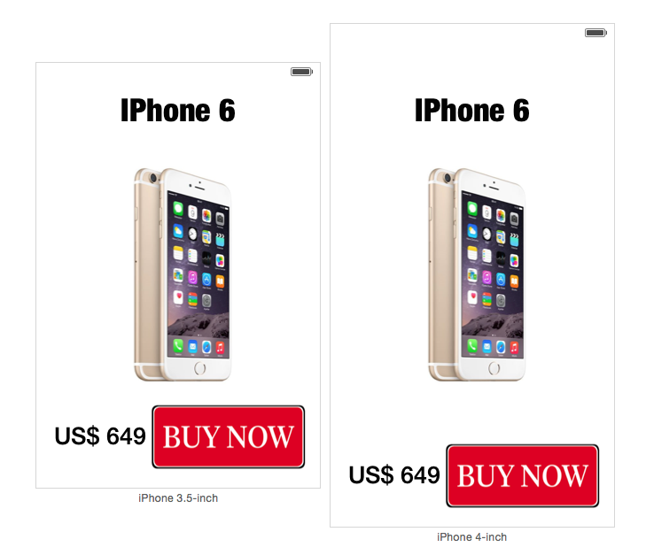
iPhone (Portrait)
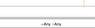
Make sure you have selected the size classes as wAny hAny in the Storyboard.
Add a UIImageView, button and 2 labels then provide necessary details as shown below.
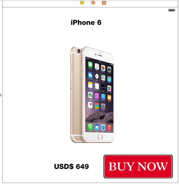
First let us design the screen for iPhones in Portrait mode by keeping Preview (Assistant Editor) adjacent to Interface builder.
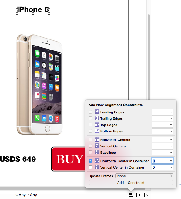
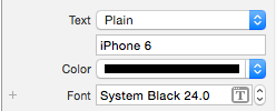
Select the iPhone 6 caption label, align it centre horizontally to the container by using the Align option.
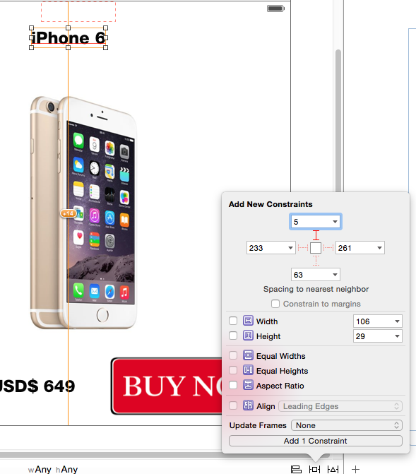
Set the distance from top layout to the label as 5 using the Pin option.
Now select the imageview and align it centre horizontally and Vertically to the container by using the Align option.
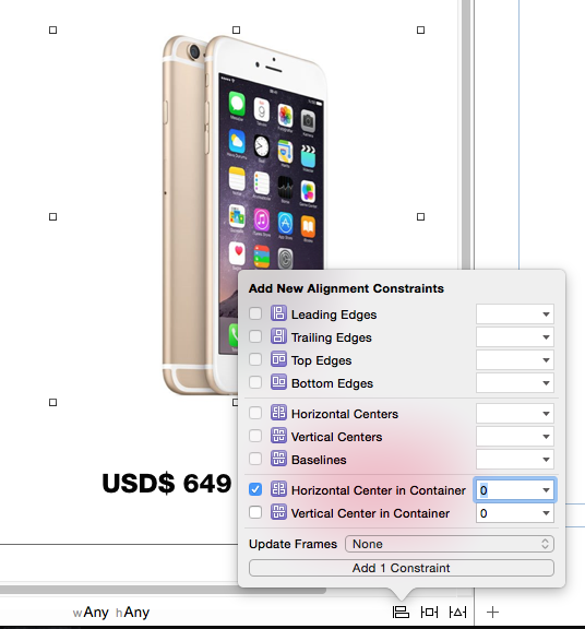
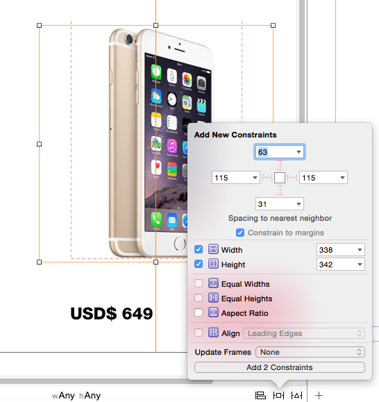
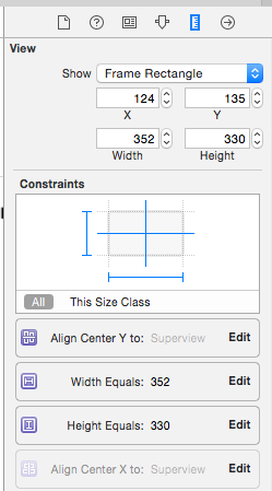
The specify the width and height constraint for the imageview using the Pin option. This would ensure that the size of imageview is uniform in all the devices.
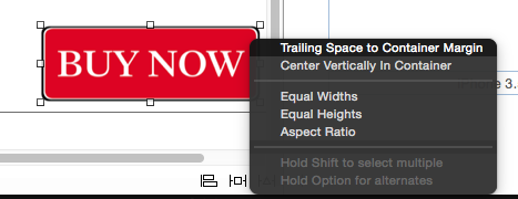
Now select the Buy Now button and add contraints to the trailing and bottom of the button. Control + drag from button to View and select Trailing space to container margin.
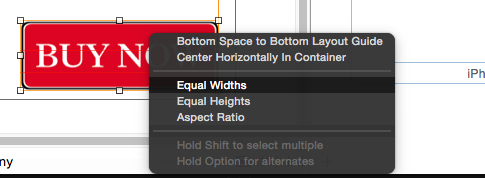
Repeat Control + drag from button to the bottom of the View and select Bottom Space to Bottom Layout Guide.
Then using the Pin option add width and height constraints for the button.
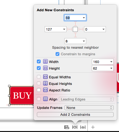
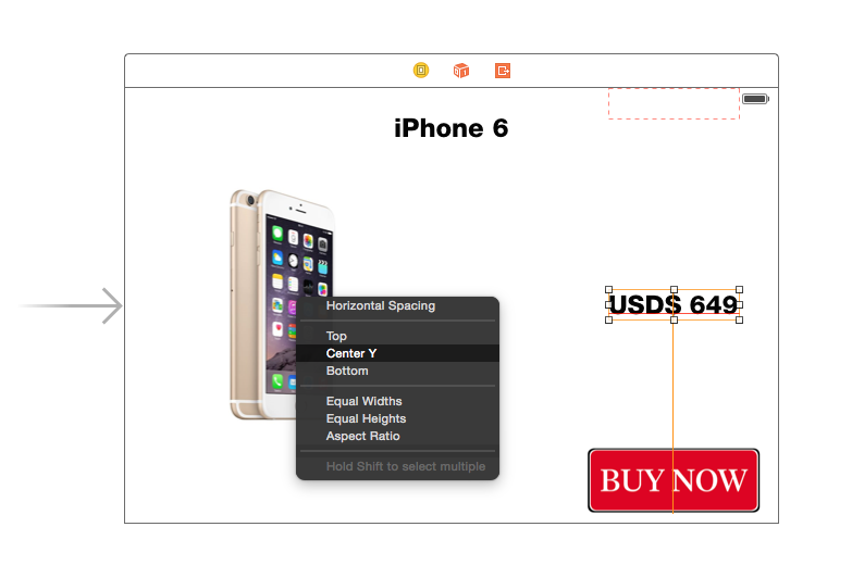
Finally the select the label which is used for displaying the price and Control + drag from label to the container.
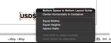
Edit the Trailing Space constraint for Price label with Buy Now button and set it to 5.

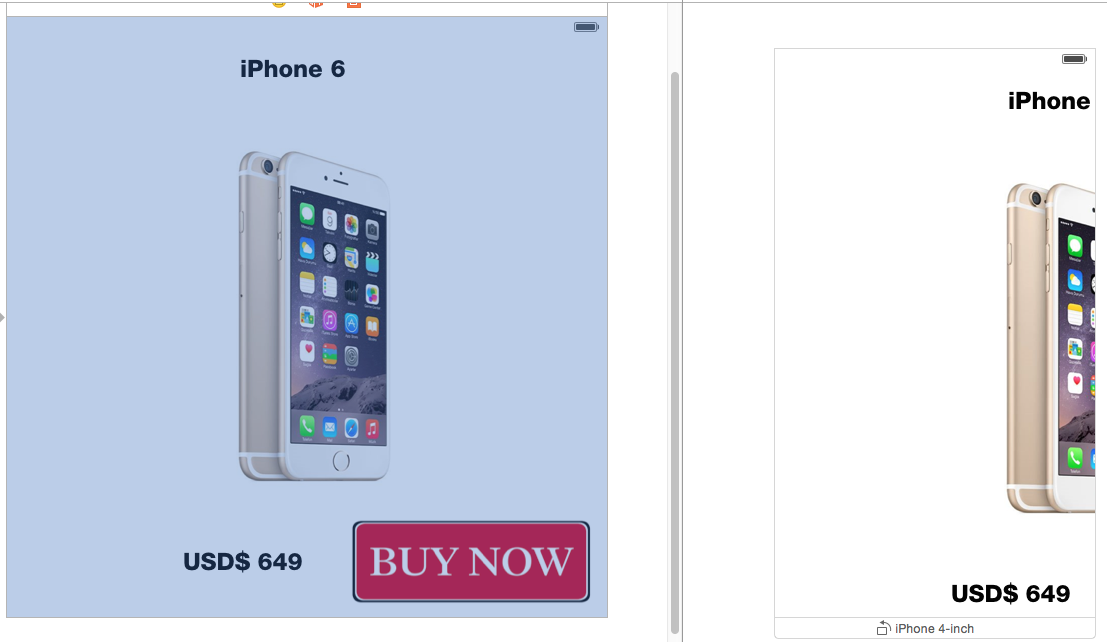
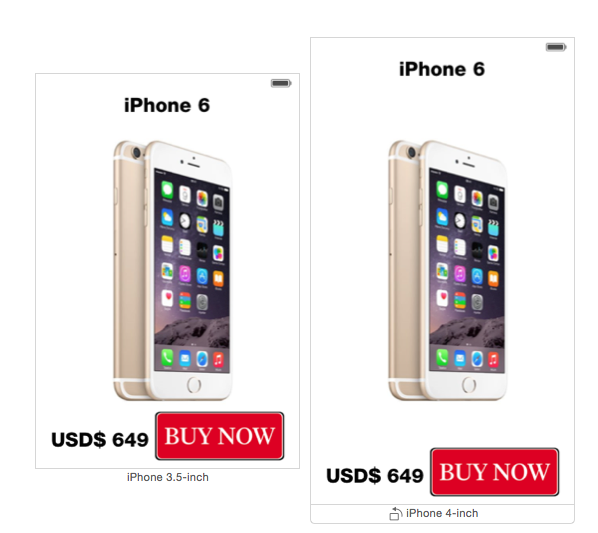
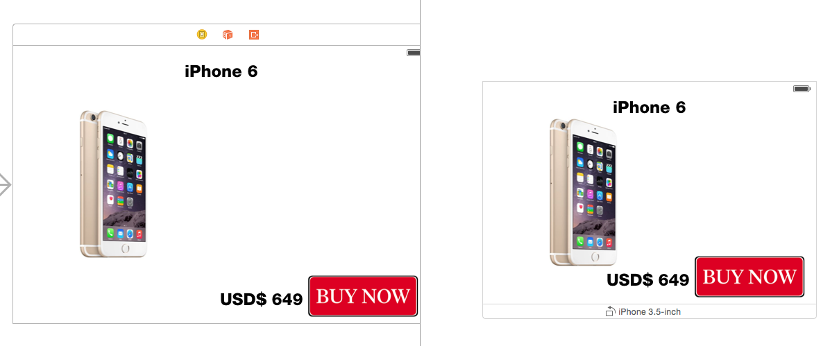
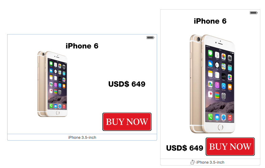
Previewing the screen changes for iPhone 3.5 and iPhone 4 should look as shown below
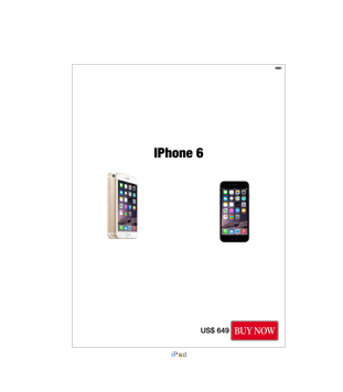
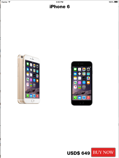
iPad (Portrait & Landscape)
iPad has lots of screen space compared to an iPhone. Let us to see how to maximize the screen usage of an iPad by adding an extra image.
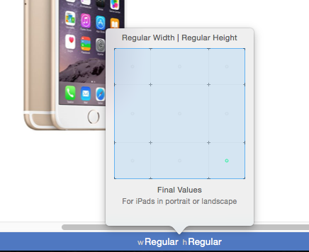
Set the size classes to wRegular hRegular to design user interfaces for iPad and iPhone. The imageview is currently aligned to centre both horizontally and vertically. We need to remove the horizontal constraint (Center X) so that the imageview can be moved towards the left handside. This should create an extra space to add another imageview to the View Controller.
Disable the Center X constraint for iPhone by navigating to Size Inspector and press the delete key.
Then pin the imageview to left side of the view without setting any margin (Pin option).

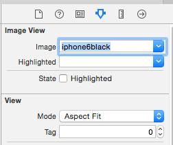
Use the Update Frame option under Resolve Auto Layout Issues to move the views based on the applied constraints. Add another ImageView to View Controller then select an iPhone 6 black image and set the view mode to Aspect Fit.
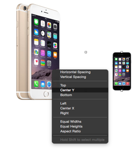
Control + drag from the imageview on the right hand side to imageview on the left hand side. Select Center Y from the list of available constraints.
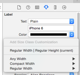
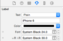
Changing Font Size for Size Classes
Adaptive Layout allows you to specify different font size based on the size class. In the Show Attributes Inspector, click the + sign next Font option and choose wRegularWidth hRegularHeight option. Now you can customize the font properties specific to iPad
Now you should see the extra image just for iPads in portrait and Landscape mode. Still there are lots of empty space but you can fill them as part of your code challenege :-). May be you can other details such as add description, rating button etc..
When you navigate back to wAny hAny size classes, the document outline should show the new image as greyed out. As the second imageview is available only in regular size classes. Also the attributes inspector for the second imageview should provide the details on installed size classes.
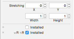
The above screenshot shows that the control installed only in wR wH size classes and not wAny hAny size classes.
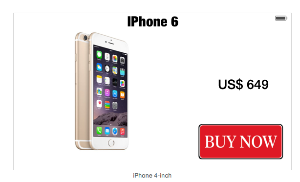
iPhone (Landscape)
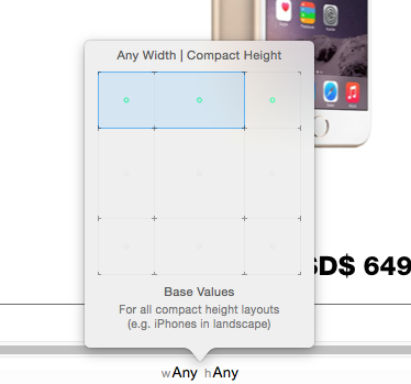
When previewing the design in both portrait and landscape, you must have noticed that some controls are hidden in landscape mode. This can be fixed by making necessary changes to compact size classes.

Set the size classes to wAny hCompact in the storyboard. Select the imageview, navigate to Size Inspector and disable the Center X constraint.
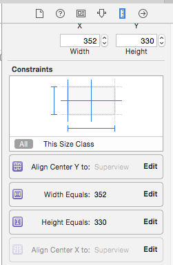
Adjust the size of imageview if it is too large in landscape mode. To reflect frame changes, select Update Constraint under Resolve Auto Layout Issues option. Another way is by editing the width and height constraint for the imageview.
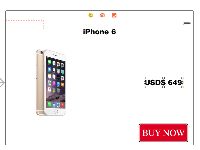
Since we want to move the price lable above the Buy Now button, remove all the constraints associated with the label.

Move the label just above the Buy Now button and centre align to the imageview.
Control + drag from Price label to Buy Now button and select Center X constraint.

Repeat the above step but this time from Price label to ImageView and select Center Y Constraint.
The final preview of screen in iPhone 3.5 portrait and landscape mode should look as shown below.
Download the source code from here
Summary
We have covered some basics of Adaptive Layout by designing user interface with size classes. changing font attibutes, installing controls,disable and editing constraints based on different size classes.